

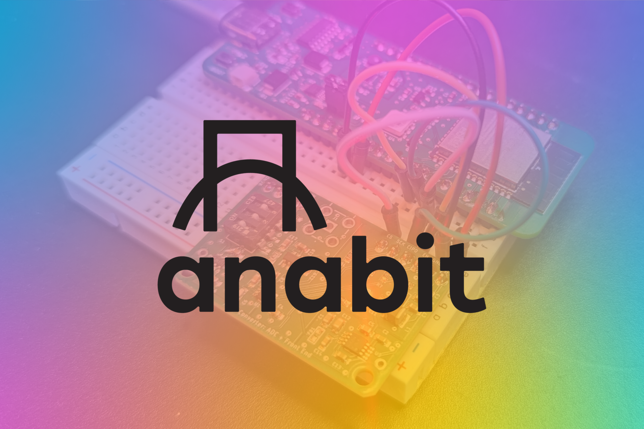
Anabit
Bridging analog and digital for the open-source community.
Anabit is on a mission to become the go-to name in data converters for the maker and open-source community, empowering innovation through accessible, high-quality technology. I partnered with Anabit to develop their brand identity.
From the start, the project was guided by Anabit’s diverse audience in mind. From hobbyists to engineers, entrepreneurs, students, and educators, the brand needed to strike a balance between technical reliability and playful approachability.
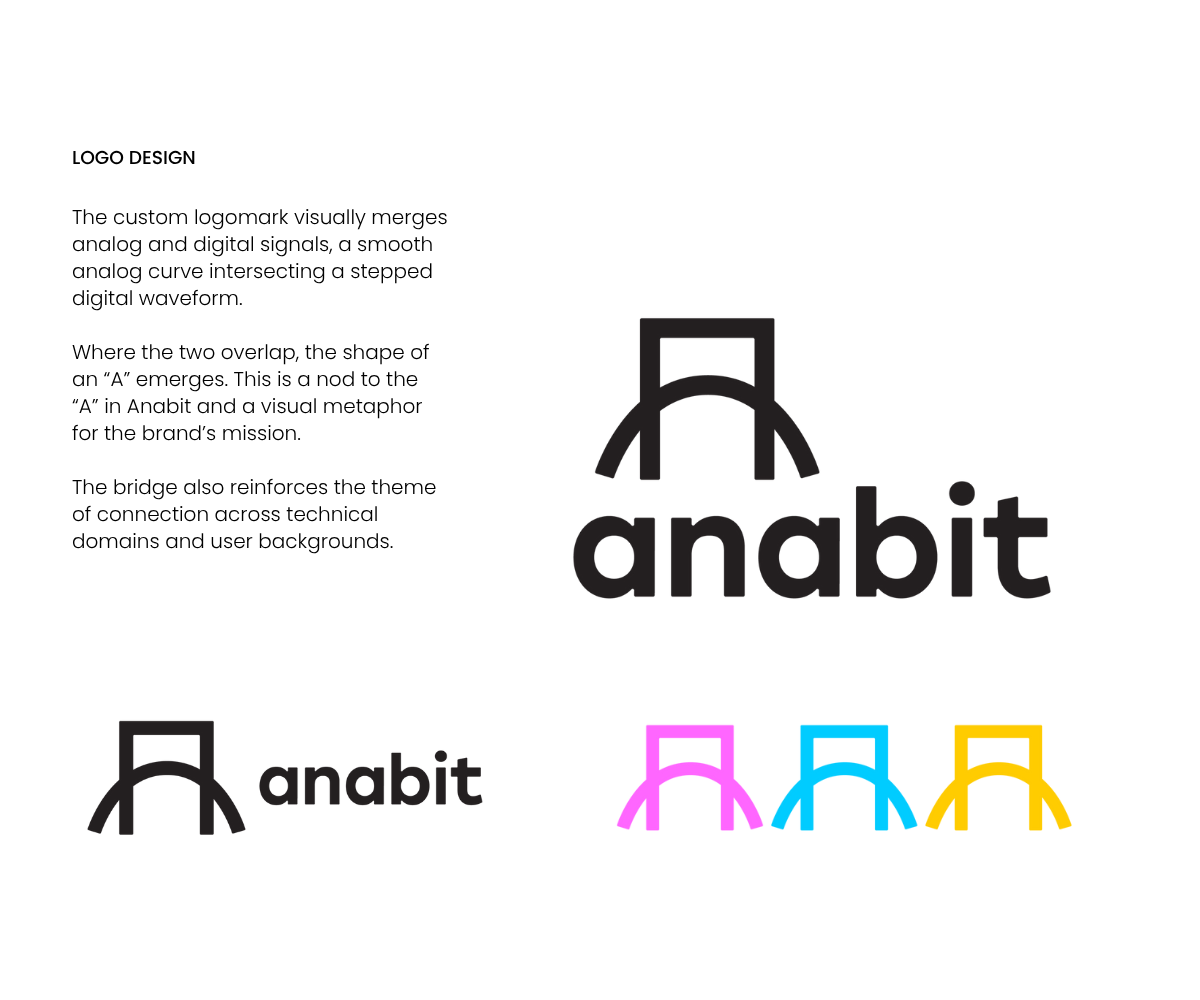
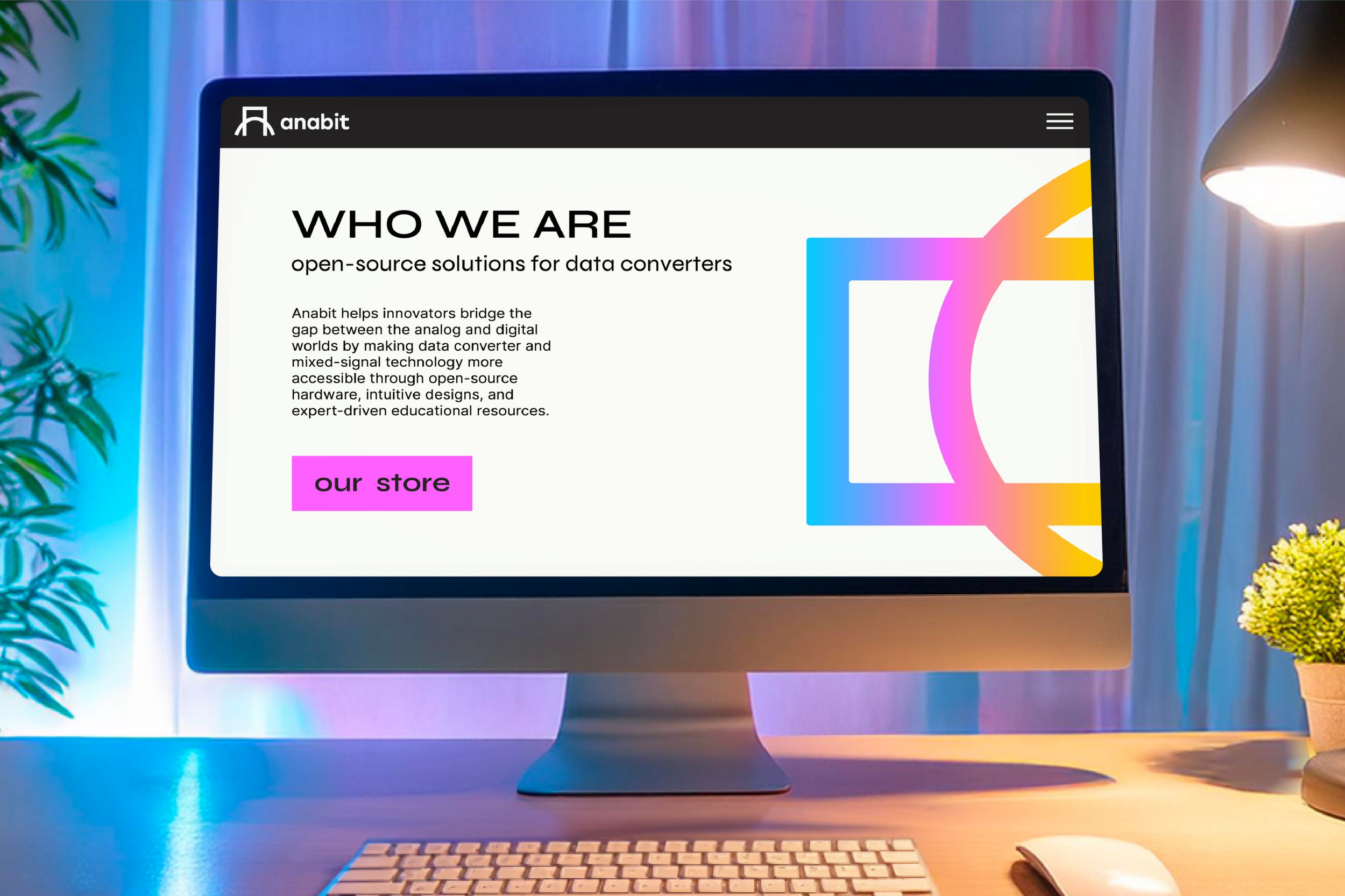
I started by exploring the brand’s conceptual foundation, the intersection of analog and digital. The logomark concept overlaps analog and digital waveforms, which forms both a bridge icon and an “A” for Anabit.
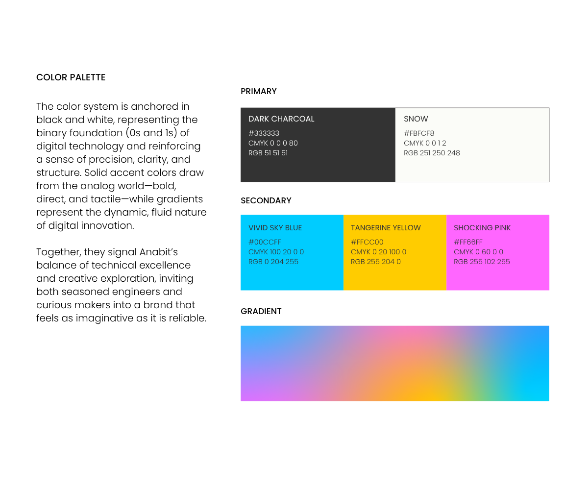
The full identity was then expanded to reflect the brand’s focus on innovation, education, and accessibility, resulting in a visual system that works in both a classroom and a tech startup. Bold but not intimidating, smart but not sterile, and always open to new possibilities.

Scope of Work
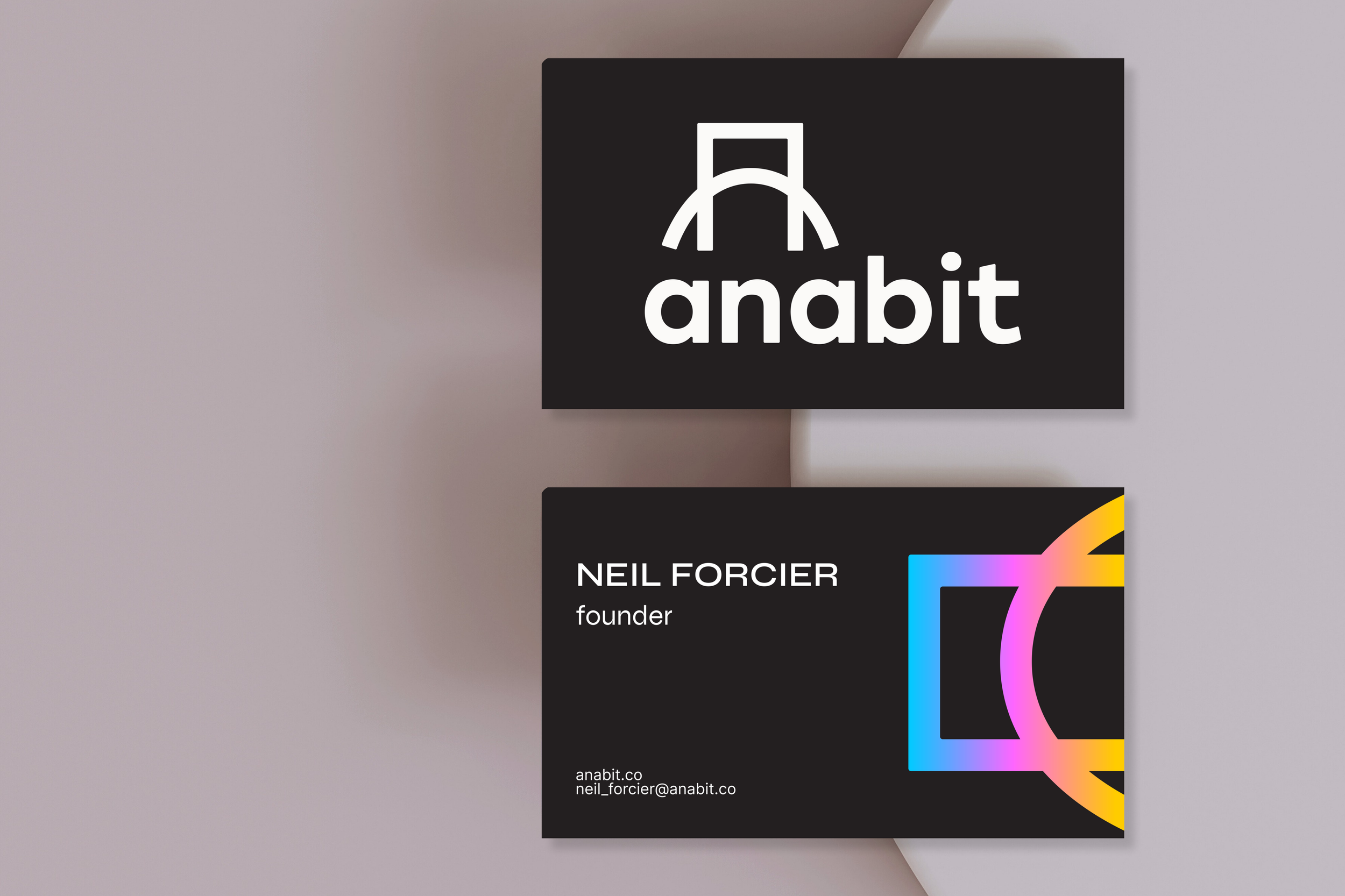
Logo design & custom logomark development
Full brand identity system: color palette, typography, visual language
Concept development rooted in analog/digital intersection
Visual storytelling aligned with brand values and mission
Brand personality expression: innovative, educational, approachable