

Inter-Can Enterprises
Multifamily real estate company based in Tucson, Arizona.
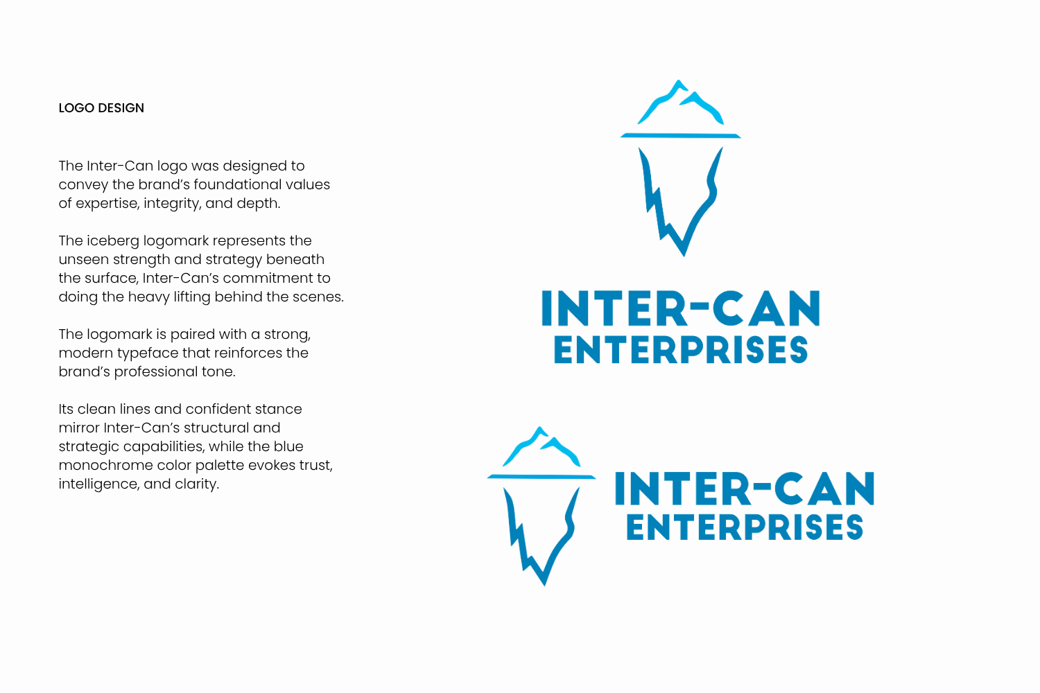
Inter-Can Enterprises needed a logo that could communicate expertise, integrity, and depth, qualities that aren’t always immediately visible, but are core to the work they do in real estate redevelopment and project management. From the start, the goal was to create a logo that reflected the company’s behind-the-scenes strategic and long-term thinking.
The concept of an iceberg became the foundation for the visual direction as a symbol of everything that happens below the surface. Paired with a clean, strong font, the resulting logo creates a visual identity that feels both grounded and quietly powerful.
This logo system gives Inter-Can a clear, memorable presence that matches the level of thought and care they bring to every project.

Scope of Work
Logo design & custom iceberg-inspired logomark development
Concept development grounded in structure, depth, and clarity
Visual storytelling aligned with Inter-Can’s values
Brand personality expression: professional, strategic, quietly powerful